Hindsight is 2020

Juror’s Statement:

It has been a long year being closed-off in many ways, but creative work knows no boundaries. This is evident from the artworks currently on view at “Hindsight is 2020” at the Columbia Art League. As usual there were many excellent entries by talented artists from our area— so many styles and visions of the past year. It was very difficult to select winners. I looked at not only the quality of the artwork, but also at the relationship of the concept to the theme of the show. I regret that some works are not included due to the large number of entries. The Art League has many opportunities for us to share our art. I’ve had a long association with the Art League and appreciate this opportunity to assist.

Award Winners:

1st Place—Brooke Cameron, Five Pages from a COVID Diary

2nd Place—Rodney Burlingame, The Came the Lockdown

3rd Place—Larry Young, 2020-SOS

Honorable Mentions:

Mike Seat—Mask it or Casket

Lindsay Picht—Watching the World from my Room

Christina Nunez—2020

Renee Hackman—Safety Glass

Sean Lofton: (re)Iterate

On exhibit 3/30/21-4/17/21 in the South Gallery

Artist Statement:

I have always had a deep interest in architecture and it has often been a driving force in my artwork. But recently, I have shifted my focus from the building to the decoration. What happens to an architectural embellishment when it is removed from its host building? Does the object lose its meaning or take on new importance? These are just some of the questions that my work seeks to answer. These sculptures rearticulate disused architecture, in order to show the way in which style, often separated by rigid parameters, can be reimagined as fluid, modular, and valuable. 

With this series of sculptures, I seek to better understand what a decontextualized and deconstructed ornament can come to represent through digital synthesis and mechanized reiteration. At its core, this work will demonstrate how the functional can be derived from the ornamental; and how the application of technology can question the role of “master” craftsperson or designer. I will continue to refine a methodology of architectural synthesis, analysis, and articulation that I can use across all styles and histories of architecture that draw my interest. My hope is that as I investigate more of these now defunct styles, I am able to uncover new meaning from old designs. To do this I have focused my attention on the Ennis House designed by Frank Lloyd Wright. Designed in 1923 for Charles and Mabel Ennis and built in 1924. It is the largest of the four existing Mayan revival textile block homes he built.


The Sketchbook Show

On view in the South Gallery at The Columbia Art League March 2nd-March 27th

This interactive gallery show has over 60 sketchbooks made by local artists. We provided the sketchbooks and each artist spent about a month making it their own. We believe that artists are made through practice, play, learning, and experimentation. A sketchbook is the perfect place to see the marks of progress and also a great way to get your art wiggles out.

When you come by to see the show, we want you to look through the sketchbooks and vote for your favorite one. We will make a limited art print from the sketchbook with the most votes and sell them at CAL. We have hand sanitizer available to use before / after you look at the sketchbooks to try and make things as safe as possible.

IMG_4016.JPG

Tiny Things Show

What is it about tiny things? They make us cock our head to the side, bring up our shoulders in a slight hunch and say… awww. Although small, the impact can be quite big when it comes to our feeling, understanding, and positioning in the world. We can understand tiny things in their entirety - we know immediately what we’re faced with, removing any possibility of fear we might have while roaming our life sized world. There can also be power in limited space, as artists and viewers alike realize limitations of scope, communicating only the bare necessities of understanding.

AWARD WINNERs

1st Place: Tony Irons, Post It

2nd Place: Matt Ballou, Curved Pleat

3rd Place: Shannon Soldner, The Ferryman’s Wages I

Honorable Mentions

Lindsey Lennon Pict, Donavon Blake, Lisa Varley, Richard Hoeppner, Leigh Roberts, Derek Fox, Jamie Scheppers, and Karalee Tearney.

Juror Statement: By Don Luper

Congratulations to all the artist for putting together a fine body of work that represented the small. If you know anything about me, which most of you don’t, I couldn’t be anymore opposite of tiny. Before pursuing an art career my job was that of a bridge welder. Once you build a few bridges the idea of going small is no longer part of your DNA. So the idea of looking at tiny little art pieces intrigued me and honestly, ended up being one of my favorite shows I have ever juried.

What is it that I look for in a work of art, regardless of scale? Does it capture my eye, if it doesn’t draw me in then how do I notice it. Once it has my attention does it intrigue me, does it hold me there? The final element that solidifies my appreciation for a piece of art above others is craftsmanship. Never throw the cart before the horse, an artist must have command of their material and process.

Tony Irons, Matt Ballou and Shannon Soldner all best represented what I look for in art and at the same time managed to put it into a very small format. Tony’s piece was selected because I found myself making several trips back to look at it. At first I couldn’t figure out if I was looking at a photo, drawing or a painting. Also, they connected with my minimalist aesthetic and I thought the use of color was fantastic. To all the honorable mention folks, well done. I thought these all represented what I look for and thought recognition was deserved.

Again, thank you for the opportunity and I wish everyone a happy and “normal” year.
DL

Details

There are about 150 artworks in the Tiny Things show and everything is priced below $300. View the entire show by clicking the button above. The slideshow below has a select few of the works on display in the Betty & Art Robins Gallery at the Columbia Art League. Visit the show in person Tuesday-Saturday 12-4PM.

Patrick Owen: Let's Get it! Let's Go!

Artist Statement:

These paintings aim to get you to seek and experiences purposeful recreation. Its that simple; go and do something fun!

A reflection and meditation on personal experiences with youth sports and recreation; the work injects small moments of my friendlier, youthful, and playful of experiences of a former self. They work, in part, as an effort to reconcile and strengthen the bridge connecting my youthful and mature responsibilities.

Let's get it! Let's Go!

Artist Bio:

Pat Owen is an artist from Columbia, MO, and received his BFA in Drawing and Painting from Columbia College in 2015. Since graduating, Pat has completed three artist residencies: The Emerging Artists Residency at Resident Arts in 2017, The Artist in Residence Program at Access Arts from 2018 through 2019, and will finish the Artist in Residence program with the Sager Braudis Gallery at the end of February 2021. Using house paint, hardware materials, to create color, texture, in sports imagery, Pat's most recent work is a response to the over consumption of and addiction to sports culture.

Divine Comedy

JANUARY 19TH - FEBRUARY 26TH

This exhibition is all in the name: Divine Comedy. Inspired by the writings of Dante, artists were roused by concepts relating to purgatory, heaven, and hell, whether found by faith, contemporary symbolism, or complete personal interpretation. The exhibit thus boasts contemplative realism concerning fears of death as well as colorful, humorous depictions of an afterlife or dream-like world. The imagination is what manifests in this show.

JUROR’S STATEMENT:

Like Dante, interpretations for the current exhibition, Divine Comedy capture a variety of emotions and attitudes. Amanda Gorman, first youth poet laureate and presidential poet stated in a recent interview, “. . .  there are no new ideas, just new ways of making them felt.” She was referring to the power of poetry. For me, when visual work is successful, it is poetic, powerfully nuanced and memorable, just as a favorite poem is. Dante wrote about universal age-old ideas, but he presented them in memorable ways for his time frame. Today his interpretation of the Inferno, Purgatorio, and Paradiso provide ample fodder for our current moment in time – the hell, purgatory and heaven of a pandemic and self-isolation.

The work submitted for this show spans the gambit of Dante’s world view from the mundane to the sublime and includes a wide variety of media – painting, drawing, photography, sculpture, mixed media and jewelry. Criteria for the selection of works were based on inventive, poignant and memorable solutions that further an understanding of Dante and a personal symbolic response to his philosophy as well as how the work impacts our current moment. How does the idea portrayed in a work make you feel? How does the artist’s point of view further our understanding or appreciation for Dante or the feelings each of us [has experienced] throughout this pandemic?  How effectively has the artist taken an age-old idea and imbued it with a fresh, and personally poignant interpretation? Some works accomplished aspects of these criteria well but fell short in others. However, many of the artists really made a significant [effort to] wrestle with the concept for the show and came upon unusual and poetic ways to experience Dante’s world view and our current moment in time.

It has been an honor and pleasure to have the opportunity to select the work and award winners for Divine Comedy. Congratulations to everyone. Thank You!

— Jo Stealey

AWARD WINNERS:

1st Place—Jane Mudd

2nd Place—Joanne Berneche

3rd Place—Richard Hoeppner

Honorable Mentions:

Travis Bond

Katelyn Smith 

Mary Redders

8 x 10’s by Lisa Franko

A south gallery Exhibition during January 2021

Artist Statement:

Mimicking visual trends found in popular home furnishing stores like IKEA, the work functions as explorations of colors, textures and design aesthetics marketed to consumers as low cost, easily assembled furniture and home goods.

The works function somewhere between the Bauhaus and the IKEA bookshelf, exploring how the marriage of design and function has been commodified and branded as a mass produced aesthetic.

Just as advertisements and store displays project a false reality that one should strive to recreate in their own homes, the perspective and proportions of the etchings and collages are purposefully skewed. The visual slippage of the work mimics the failure of consumable objects to function in their intended ways once they actually enter our homes.


The added layer of using the work of female artists in the creation of rugs highlights the role of women in the home, particularly in the decision making around design and decoration.

Artist Bio:

Lisa Franko is an artist and educator living and working in Columbia, MO. Originally from Ohio, she received her BFA and Art Education degree from the University of Toledo and her MFA from the University of Missouri.

Gallery hours: 12-4PM Tuesday-Saturday - you can stop by anytime during our open hours to view the show.

For a private viewing of the show, contact Kelsey to set something up.


Intersection by Kate Gray

A South Gallery Exhibition on view through December 30th

Intersection: finding and re-finding one’s Center

Artist statement:

The Intersection body of work explores the process of finding and re-finding one’s Center in an effort to visually capture something words can’t describe - what it feels like to be centered in the chaotic journey of life.

The imagery in the paintings was inspired by a growing love of Tai Chi and Chinese calligraphy (thanks to Lilian Sung’s class at the Columbia Art League). I have always been drawn to the art form of Chinese calligraphy, specifically how it combines the visual arts with an interpretation of a literal meaning. Based on that concept, I created a series of Chinese-like characters that symbolize one’s path, way and living in the Center. In each painting, I incorporated one of the characters and intersected it with the chaos and frenetic nature of the world that surrounds us. By intersecting the essence of daily life with a quest for balance, the final painting represents an evolving path towards finding an re-finding Center.

Gallery hours: 12-4PM Tuesday-Saturday - you can stop by anytime during our open hours to view the show.

Saturday, December 12th 1-3PM: Intersection Artist Chat with Kate Gray - stop by to chat with Kate about her show. Masks required.

For a private viewing of the show, contact Kelsey to set something up.

To view the show online and shop online click the button below.

Artist on Display: Richelle Douglas

About the Artist

RD: “I’m a graphic designer and artist. I’m a wife and mother to two sweet boys. I create art because it brings myself and others joy. That may sound trite...but it’s the simple truth.”

RD: “I’ve been creating art for as long as I can remember. Since I was a child. It’s always been something I’ve enjoyed, and to be honest I never thought I’d create a living from it.”

RD: “I’ve created art using all sorts of mediums, but within the past 4 years I’ve been perfecting my technique of painting with fabric dye on muslin.”

RD: “I stumbled upon this years ago when I originally tried to create a fun design on fabric for a baby gift. I’ve played with fabric gel pens to fabric markers, to my current medium...fabric dye. I love it because it gives a water color effect and I’ve always been drawn to the look of watercolor. At the end of last year I switched from using paint brushes to painting or drawing with a nib pen. I love how detailed I can get with the fine point tip. I toggle between using one or the other or both. At times I leave the paintings as is, and other times I’ll use the painted fabric for sewing shoulder bags, pillows or wine bags. These are usually commissioned pieces and are both fun and functional works of art.”

RD: “But I’ve not forgotten my skills as a graphic artist, and will also take my paintings and incorporate text, either on the actual art or scanning a painting onto the computer and creating digital art.”

RD: “I’m a graphic tee junky and LOVE making fun T-shirt designs.”

Inspirations and work

RD: “I painted the ostrich back in May of this year during the lockdown. I was jokingly feeling like I just wanted to shove my head in the sand and hide from all the craziness...so I painted this cute little gal and called her Self Portrait of 2020.”

RD: “Generally I stick to animals, but I do love landscapes and city scapes. I also love vintage and retro graphics and will incorporate this in a lot of my art work. And lately I’ve been playing around with botanicals as well.”

Richelle Douglas, Self Portrait of 2020, Muslin and fabric dye, $250

Richelle Douglas, Self Portrait of 2020, Muslin and fabric dye, $250

RD: “I co owned a photography studio after college, but separated from that business after my 2nd son was born. Currently I have a little art studio called CROE Haven Designs. I sell my originals and reproduction prints along with t-shirts, stickers, and a few other items. I prefer creating art that have messages of kindness love and faith. I’m also an advocate for the fight against human trafficking. I’m an ambassador for the Prevention Project, a curriculum created to bring awareness and education to youth. I volunteer with the Stop Human Trafficking Coalition of Central Missouri, and have a strong passion for educating our youth about Human trafficking.”

RD: “I love supporting the arts and being plugged into the community.”

RD:”After my 2nd son was born I took a break from my art. I really felt distanced from this part of my life and outta the art scene. So being a member of CAL and participating in art shows has helped me step back into it.”


Give the Gift of Art: Winter Members’ Show

November 10th-January 5th

This un-themed, Members’-only show is always a holiday delight! We invite our artists to showcase the work that they are most proud of, giving you the opportunity to snatch it up as a holiday gift!

As 2020 comes to a close, we cannot forget the many challenges it has brought, but as this exhibit surely attests, art endures. The creative spirit of our wonderful community here at CAL is anything but deterred or discouraged. These artists remind us that the world around us brims with possibility, meaning, beauty, wonder, humor, and more! At the end of a year such as this, what better gift is there to give?

Our juror, Lee Ann Garrison notes, "walking into one of the Columbia Art League’s Member Exhibitions is always a treat because we never know who has entered and what artworks we will see. Columbia is a community passionate about the arts, about seeing art and making art. And, as always, jurying such an eclectic and varied group of artworks is always challenging... As a juror, I bring my own history of art making and of thinking and teaching about art and design...Members exhibitions and ever-changing jurors make for an engaging conversation about art. We dwell in an art community and learn from these conversations with each other over time."

1st Place:  Deb Roberts, Quilt Study

This tiny gouache painting struck me as little gem of geometry with an extraordinary sense of color.

2nd Place:  Donovan Blake, Shimmering Lake Tahoe

The close-up photograph of water’s surface creates an image that perfectly balances abstraction and realism.

3rd Place:  Tom Stauder, Canarywood Vessel with Threaded Ebony Lid

This small symmetrical vessel is a classic definition of simplicity and elegance with craftmanship so perfect it disappeared.

 Honorable Mention:

·      Ramsey Wise, #4

·      Cynthia Richards, Blue at the Top of the Stairs

·      Jennifer Wiggs, Nothing Begins or Ends

·      Chad La Fever, Invertebrate

Artists Take the Big Muddy: An En Plein Air Event

Plein air painting is a french methodology of capturing the outdoors, acting in contrast to academic studio painting.

about The process

Brisk winds disrupted weather in the upper 70s, and golden trees filled a crystal blue sky last Thursday afternoon, as six artists boarded a boat charted by the Missouri River Relief with canvases, paints, easels, lawn chairs, snacks, and water in tow.

Captain Steve Schnarr swept these artists up stream to banks unreachable by foot, dropping pairs off on varying topographies and angles.

Once at their chosen location, which included a sandy beach, a rocky shore, and a mud bank, the artists scouted out compositions and set to work capturing the surrounding landscape. Some chose views facing the ever moving sun, others looked towards autumn stricken trees, and still others faced down snaking undulations of water.

Over the course of the next three hours, each artist rendered the Missouri River and its surrounding land masses with a unique hand, as no two paintings were accomplished in remote similarity.

As 5 o’clock rolled around, the participants were retrieved by the Missouri River Relief crew and called it a day on their paintings. Riding back to Cooper’s Landing the artists posed for pictures, chatted about their Plein air experiences, and reveled in the beauty of the Big Muddy.

About the show

We believe that artists play a key role with the broader public in inspiring appreciation and connection to our region’s abundant natural resources and unique geography.

This event advances Missouri River Relief’s mission to connect people to the Missouri River through hands-on river clean-ups, education, and stewardship activities.

You can view these En Plein Air style works of the Big Muddy by visiting the South Gallery of CAL throughout the month of November, Tuesday-Saturday, 12-4 PM. A silent auction will be held November 9th-14th for the paintings as well.

Artist on Display: Kate Gray

Conversation in Color by Kate Gray is currently on view in the Betty & Art Robbins Gallery of CAL Tuesday-Saturday, 12-4 PM.

Conversation in Color by Kate Gray is currently on view in the Betty & Art Robbins Gallery of CAL Tuesday-Saturday, 12-4 PM.

CAL aims to help artists succeed, whether that's offering skill building classes, the opportunity to exhibit work in our gallery, or sell work in our Gift Gallery. Our Artist on Display series invites you to get to know our artists a little bit better! 

About the Artist

KG: “My name is Kate Gray. I am an artist and a designer. Or more simply - a “creative” who loves a good problem to explore and solve. I create because I have no other choice. It is who I am.”

KG: “With out sharing my age… I have been creating since as long as I can remember. I have always been an artist.”

KG: “It did take me awhile to become comfortable in my "art skin.” That evolution happened after I went back to school and received my MFA in Graphic Design in 2015.” 

Multimedia Transformation

KG: “Before grad school, I was a watercolor purest! That was the only medium I used. Grad school gave me the fabulous gift and opportunity to explore all media.”

KG: “Now, I use any and everything I want to create. Today, it is fun and freeing to play in a limitless creative world.”

KG: “For my piece in The Figure, I wanted to see if I could paint on canvas with acrylic like I did (in my earlier art years) using watercolor on paper. This painting was a blast to create. Since I am a fan of portraits, I used an abstract face as the focal point of the piece.”

Inspirations & Themes

KG: “I like the challenge of translating 3-D art forms, like Tai Chi, into a 2-D form, like a painting. Writing is another important part of my process and, in some cases, I will pair poetry with the final paintings.”

KG: “Overall, the theme of my work is personal growth and evolution.”

KG: “For example, my solo show at the Art League in December is titled: Intersection: the process of finding and re-finding one’s Center. In this show, I created Chinese calligraphy symbols that mean; the way, the path and in the Center. I used one of these symbols in each painting as a starting place for the work. All of the pieces in this show will also have poetry displayed with them.” 

Life & CAL

KG: “My past occupations include: college professor, gallery director, art and creative director, stylist and graphic designer. Currently, I am a graphic designer at Independent Stave Company.”

KG: “CAL is my art home and family.”

KG: “The first two people I met when I moved to town 20 years ago, I met at the League. Those individuals and the organization changed my life. I would not be the “creative” I am today without them.”

To purchase Conversation in Color by Gray click here—The Figure

Artist on Display: Shayna Buckridge

CAL aims to help artists succeed, whether that's offering skill building classes, the opportunity to exhibit work in our gallery, or sell work in our Gift Gallery. Our Artist on Display series invites you to get to know our artists a little bit better! 

About the Artist

SB: I choose to create because it’s the best form of therapy. I choose to create because there don’t seem to be enough words in the world to explain the things I hold most dear.

SB: I’ve been creating since I was about 13. Once I discovered I had a natural ability, my focus turned toward art almost exclusively.

SB: I definitely have a hard time focusing on one medium, part of the fun of art for me is exploring and learning new crafts but charcoal is certainly my favorite.

SB: While I may be dabbling in a lot of different kinds of work, I’m almost always working on a charcoal piece. I love the versatility of charcoal and challenging myself to take a medium that is so loose and messy and really refine it, getting as many details into a drawing as possible. 

Inspirations & Execution

SB: Both of my pieces in The Figure focus on the duality of human emotion and how humans often feel many different things at once.

SB: I’m interested in how we experience conflicting emotions simultaneously and how those emotions show themselves in small ways on our bodies. There tends to be an emotion on the surface that I think the subject is choosing to show to the outside world but if you look closer you may notice the way they are holding their hands or tension in their neck and it hints at something more. 

SB: The main theme I’m focused on right now is human emotions. My aim is to capture the complexity of emotions. I am very detail oriented and texture plays a big role in most of my work. For me, creating tedious texture becomes a sort of meditation. 


Roots

Growing up in Columbia, it’s easy to feel the effects CAL has on our community and it’s an honor to be a part of that. I have been hesitant to show my art but when I challenged myself to make it happen I knew I wanted to stay close to home and CAL would be a great place to start.

To purchase a piece by Buckridge click here—The Figure

Awful // Cute

Photographs by Anastasia Pottinger

The idea for this project came about when I peeked into the backseat of a friend's car to see their 4 year old in a tiny mask.  It was the cutest thing I had seen and I could not stop thinking about it.  That night on social media, I mentioned seeing him and that I should think about doing a project with kids in masks.  I was flooded with responses of people offering their little ones to be photographed.  I got to work and photographed as many as I could in 4 days and this is the representation of that work. 

Since then, I have thought and thought about what I want to say about the images.  I photographed each child quickly, just showing up, standing outside and composing the image with no instructions.  I wanted to show the boldness or unease naturally represented in children this age.  Parents were told to allow the child to wear whatever they wanted and to select their favorite mask.  I explained I didn't want this to be a statement about masks in particular, but a representation of the moment. 

Here we are.  2020 in America during a global pandemic.  Our children are wearing masks.  It is at once awful and cute.

AWFUL/CUTE will be on display through October 31, 2020.

Gallery hours: Noon-4PM, Tuesday-Saturday

Artist on Display: Jane Mudd

Hell by Jane Mudd is currently on view in the Betty Art Robbins Gallery of CAL Tuesday-Saturday, 12-4 PM.

Hell by Jane Mudd is currently on view in the Betty Art Robbins Gallery of CAL Tuesday-Saturday, 12-4 PM.

CAL aims to help artists succeed, whether that's offering skill building classes, the opportunity to exhibit work in our gallery, or sell work in our Gift Gallery. Our Artist on Display series invites you to get to know our artists a little bit better! 

About the artist

JM: I live on a farm East if Fulton. When I moved here from StL in ‘77, I continued to make art while raising a family and working various social work jobs. In 1994, I received an MFA from MU.  I recently retired from William Woods as Assistant Professor of Art. 

A Life in the Arts

JM: I’ve worked in all the traditional media, but for the most part, oils. I’ve explored numerous themes, approaches and art processes; from alla prima, to exploring grisaille and glazing.

JM: Main subjects are landscapes, portraits and still life’s, as well as storytelling and re-storytelling.

JM: I have been an advocate for the arts for a long time and have organized and hung hundreds of exhibits for other artists -at WWU, Orr Street Studios and the Art House in Fulton. 

Exhibiting work

JM: The drawing for The Figure show was from a model who was willing to get into the fetal position for me. It’s a universal pose everyone can relate to -especially this year. 

JM: I have been involved with the Columbia Art League for a long time (since the 80’s I think). It has been a wonderful venue for showing work, and learning from and getting to know other artists. The theme shows are challenging and fun -The best part is seeing everyone else’s work. 

Artist on Display: Jacob Lopez

CAL aims to help artists succeed, whether that's offering skill building classes, the opportunity to exhibit work in our gallery, or sell work in our Gift Gallery. Our Artist on Display series invites you to get to know our artists a little bit better! 

About the artist

JL: I'm Jacob Lopez, born in Temecula, CA and raised here in Columbia. I’m 20 years old and create as an outlet for struggles I've come across (Mental illness, my sexuality and general day to day findings.) Art in any form, I think, is the best way to express things words can't sometimes. 

JL: I've been creating ever since I could remember. I started with just drawing and making crafts with my grandma, but found some talent in there and kept going with it.

JL: My inspirations in general are the pop artists like, Andy Warhol, Keith Haring, Robert Rauschenberg, Roy Lichtenstein and various other artists that use color and silkscreening as a medium. Also inspired by the 80s for color and aesthetic.

JL: I am currently a tire technician, my other "hobby" and enjoyment is cars. 

Developing a Rhythm

JL: I've frequently switched mediums, but recently have been practicing spray paint & photo emulsion silkscreen. My practice has evolved in creating more meaningful pieces and using more color. 

JL: I generally explore color and imagery. With thought-provoking meanings. Not necessarily "edgy" maybe, but I try adding more to the question of "What is art"?

JL: Anything can be art, Warhol was that artist. I enjoy having meaning and thoughts, alongside color and imagery that may not be accepted into a "normal" world. 

internal reflection

JL: "Media" came out of an idea, thought or "reason" why I'm gay. Somehow it’s different, based on how I, specifically, noticed more males in advertising and media than women.

JL: "Thoughts" is similarly based on the idea of male form, and that reasoning behind me being the way I am. Also, it includes an aspect of self harm, and how I view differences.

JL: Normality for me is seeing scars on different pieces of the body.

The Figure

The tradition of the human figure in art continues to inspire and challenge artists today. Whether abstracted or realistic, we experience the figure in art both visually and physically.

There is something joyous and celebratory about seeing this show, being surrounded by the human figure when we’ve been cloistered for so long. People, other human figures, sit, stand, kneel, curl, and contort while we walk amongst them. Our masked face is still a reminder that we need to be safe and think about those around us, but for a quiet moment, this show allows us to feel the freedom of being with others.

Our award winners

First Place: James Brown, Sisyphus 2020

Second Place: Shannon Soldner, Repose

Third Place: Deb Roberts, Front & Back

Honorable Mentions: Matt Ballou, Shayna Buckridge, Shane Epping, Jane Mudd.

To see ALL of the work featured in The Figure show, visit the gallery in person, or click the button below.

Juror’s Statement

The Figure  | Juror’s Statement | Valerie Wedel

Every time I come into the Columbia Art League, I am struck by the quality and variety of work produced by our local art community, and this time was no exception. I felt privileged to be able to spend time with these pieces to make selections. In doing so, I not only considered qualities such as craftsmanship and use of the elements and principles of art, but also asked myself whether the artist brings a unique voice to the overall exhibition. Risk-taking is also an important aspect of artistic growth, which I attempted to recognize as well, for with continued practice, these efforts can lay the groundwork for future mastery. 

The best works hit the mark in all the above categories. The moment I saw Jim Brown’s Sisyphus 2020 bronze, I thought “that’s how we all feel right now,” and it has been occupying my mind for days. Exceptional artwork offers something new every time one looks at it and I experienced that with Shannon Solder’s Repose and her deft brushstrokes of rich colors in subtle combinations. I had a similar experience when engaging with Front & Back, by Deb Roberts. It was like reading a mystery story about negotiating with one’s own body. 

Depictions of the human form have been with us since prehistoric people began making marks on cave walls. The fact that there are still new things to say through the figure is evidenced by this magnificent show.

Bio

Valerie Wedel is a 2007 graduate of the University of Missouri-Columbia in Sculpture (MFA) with a focus on performance and video installation. In 2002, she earned a BFA in Painting and Drawing from Columbia College and in 1991, a BA in French and Peace Studies from Washington University in St. Louis. She has taught at Stephens College, Columbia College, and Missouri Valley College. She currently teaches studio art at William Woods University and is co-editing a new edition of the textbook Drawing the Human Form, by William A. Berry. Her work is exhibited regularly in galleries throughout the Midwest.

Rural Reflections by Marilyn Cummins

Three barns, prior framing, for the series: Rural Reflections. These works alongside additional barns and landscapes are currently exhibiting at Central Bank off 8th & Broadway.

Three barns, prior framing, for the series: Rural Reflections. These works alongside additional barns and landscapes are currently exhibiting at Central Bank off 8th & Broadway.

ARTIST STATEMENT

Rural reflections

This collection of reflections on the landscapes, barns and images of Missouri and beyond contains several new paintings that mark my return to my creating art after a pause that was much longer than I had intended. It’s good to be back. My latest works are a series of barn portraits, based on photos I shoot on any and every road trip as I hunt barns along the way. Converting them to the pen & ink and watercolor paintings here has been cathartic in the time of COVID-19 self-quarantine, which included moving back to my home studio from more than a decade at Orr Street Studios. Paintings based on friends’ photos as reference, with permission, are noted as such in the titles. 

I feel a deep connection to land and sky, tree lines and rural structures. Growing up on a farm on what was once unending prairie in Northwest Missouri, my memories are of sitting in a feed bunk after chores and watching the sun set behind a windbreak of trees; riding my horse or walking along dirt and gravel roads lined by hedge trees, pastures and grain fields; flying over the land with my dad in his small plane and seeing our farm and fields from a whole new perspective. Both he and the farm are gone; more barns disappear with storms and the passage of time; fields become developments. I hope my reflections bring a flicker of memory, spark a desire to preserve both nature and our rural heritage, or bring a bit of solace and peace in dark times.

CONNECT WITH THE ARTIST

Email: mlcummins@cumminsconsult.com

Website: https://invinciblesummerstudios.com/


Artist on Display: Pamela Gainor

Gainor seated with her grandkids.

Gainor seated with her grandkids.

CAL aims to help artists succeed, whether that's offering skill building classes, the opportunity to exhibit work in our gallery, or sell work in our Gift Gallery. Our Artist on Display series invites you to get to know our artists a little bit better! 

ABOUT THE ARTIST

PG: Who am I? I am a retired oncology nurse but have had many jobs over the years from hospital administration and vocational rehabilitation to teaching sewing and quilting.  I’m a wife, mom, and grandmother and sometime community volunteer.  This is my sixth year serving on the CAL board.  I volunteered at my children’s school library for many years.

PG: Other than being in my studio, which is half of our family room, my favorite place is a library or a bookstore.

PG: I don’t really think I choose to create, it is just something I have always done and feel compelled to do.  

PG: My first memory of the joy and mystery of painting was when I was very small and visited my grandfather’s garage studio. I have never forgotten the smell of oil paint, linseed oil and Camel cigarettes.  

PG: My first art show was a CAL show at Central Bank (Boone County Bank then) in the 80’s where I won first place in fiber.  My first entry in a CAL show was an art quilt.  I think I was responsible for the addition of size limitations on art submissions!  I still sew a lot of my clothes but gave up on quilts quite a while ago.  They took way too long when I was working and had kids at home. Storage became an issue as well.  

Turning to paint

PG: I started playing with oil paints, ruined many brushes and finally took Shannon Soldner’s class at CAL to learn how to work with them.  I love that oil paints don’t dry out quickly.  I love that you can mix them on the canvas and it turns out I can just use my fingers.

PG: I very rarely use brushes with oil paint.  It was almost a phobia that a brush would mean that an image would actually have to look like something specific.  That has always been difficult for me.  I don’t draw well and have never had the patience to put in the practice time needed.  

PG: There is nothing I like more than just starting a blank canvas and smearing on the first color, then adding another and then another, working and reworking until it becomes done.

Themes and inspirations

PG: I work intuitively and although I don’t normally try to paint something real, my paintings usually wind up as abstract landscapes.

PG: The theme that I am especially interested in is the power of nature and how small and often misguided we humans are.  We think we know so much until nature shows her power.  

PG: The contrasting theme is the resilience of man, how we will rebuild and rebuild, how tenacious we are.  

PG: I also paint just for the joy of seeing color.  Encaustic (hot wax mixed with oil pigments) has become another medium for its strong, luminous color and that, like oil paint, is tactile and moveable. 

Exhibiting work

PG: The monochrome show was a challenge.  I decided to do tiny monochrome pictures of the primary colors.  I tried to show just how many variations of those colors I could make in a tiny space.  That piece really represents the opposite of monochrome.  

PG: I love the Art League community.  It is a very welcoming place for all levels of artists.  It’s easy to enter shows and I’ve found that the other artists are mostly just like me: somewhat nervous to put out their work for all to see, fearful of being judged, generally introverted but brave in the end and very friendly.  

Artist on Display: Cynthia Richards

Richards received first place for her photo “Lapse of Memory,” currently on display in the Monochrome exhibition.

Richards received first place for her photo “Lapse of Memory,” currently on display in the Monochrome exhibition.

CAL aims to help artists succeed, whether that's offering skill building classes, the opportunity to exhibit work in our gallery, or sell work in our Gift Gallery. Our Artist on Display series invites you to get to know our artists a little bit better! 

ABOUT THE ARTIST

CR: I have an M.A. in philosophy, and a Ph.D. in comparative literature with an emphasis on drama.  Aside from creating art, I have been heavily involved in political activism over the years.

CR: I don't remember ever actually choosing to create. It has been central to my life for as long as I can remember; it's always been a big part of who I am.

Developing curiosity

CR: Years ago, writing short stories, poetry and plays took up a great deal of my time.  Then I went to graduate school and found that when I was writing papers there was an imaginary but very tough critic always leaning over my shoulder, making me spend hours revising paragraphs. This carried over to my creative writing efforts, and caused me eventually to lose interest in pursuing writing of any kind. 

CR: Several years after grad school I had the opportunity to spend some time in Spain. Suddenly I was seeing all kinds of striking light, lines, shapes, and shadows. I realized I wanted to capture them, and that even though I knew next to nothing about photography, I could at least give it a try.

CR: I also realized I could try with the camera on the phone I had right there in my purse!  Those first shots were exciting for me, and I've been obsessed with making photos ever since.  I definitely didn't pick this medium. It worked its magic on me, and it got me hooked.

CApturing a process

CR: At first I was mainly taking shots of what I just happened to see: a geometric shape, for example, made by sunlight hitting a wall at a particular slant. Soon, though, I began to experiment with building my own scenes at home, and that practice continues today. 

CR: I love collecting random objects (often from flea markets), making temporary constructions with them, and seeing how the sun interacts with them. 

CR: My favorite "prop" is a multi-colored set of rectangular plexiglass frame samples from an art framer.  I've gotten hours and hours of photo time with those samples! 

CR: Currently I've been doing a lot of shots with copper flashing. It's great because it bends, and has a shiny side as well as a dull side. 

CR: In short, I've moved from trying to capture what I happened to find interesting, to trying to create the possibility for something interesting to be captured.  

Themes & inspirations

CR: The often unseen visual power of ordinary objects is a main theme that I keep returning to. Also, when making photos, for me it's like doing a meditation that takes me out of myself and connects me to something much greater.  That's what I enjoy pursuing, and I hope that others who view my photos have a similar experience.

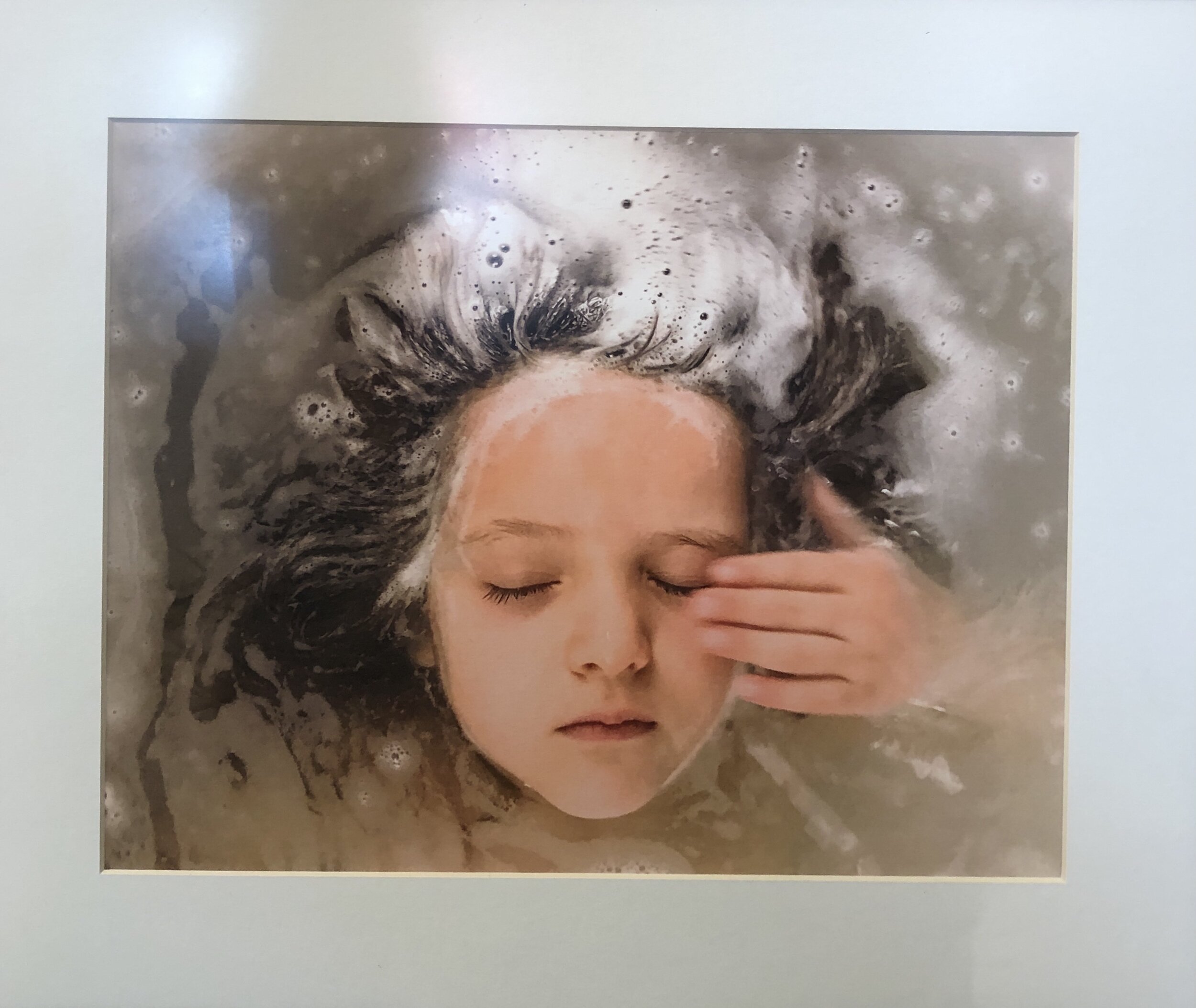
CR: When shooting the winning piece, "Lapse of Memory", I was working with a sushi mat and a cloudy vase on a table on a gray day with little sunlight coming in. When I saw the photos from that session, I immediately thought of the difficult cognitive struggles that a close relative was then experiencing, and made edits with that in mind.

CR: The other photo in the show, "Daybreak," was inspired by morning light shining on architectural details near the ceiling.  This is an example of my former practice of finding a subject and shooting rather than building a subject and shooting, but sometimes it's just there and you've got to take it!  (And with the sun, you've got to be quick!)